- Client
- Albatros
- Year
- 2021
- Industry
- Work & Travel
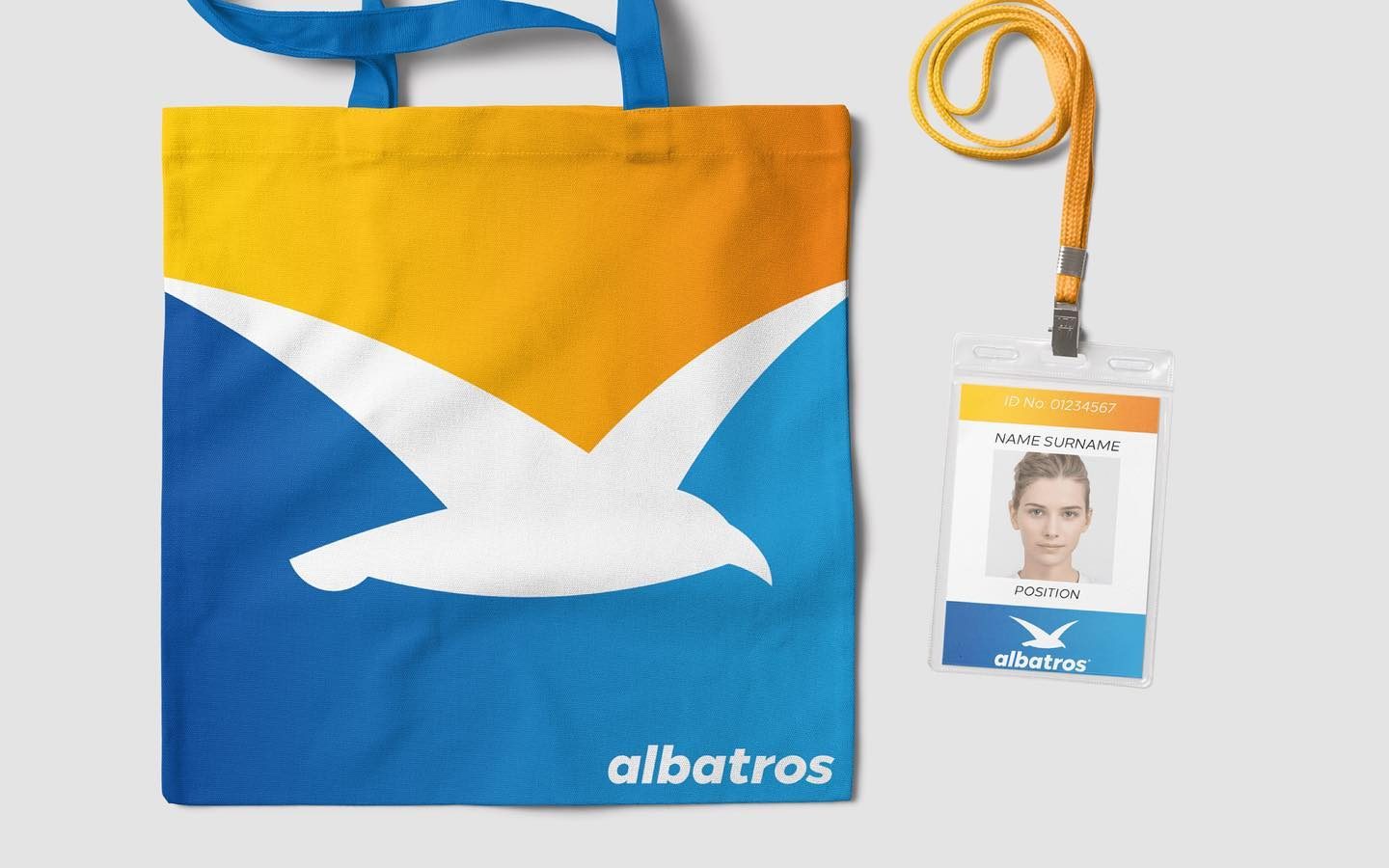
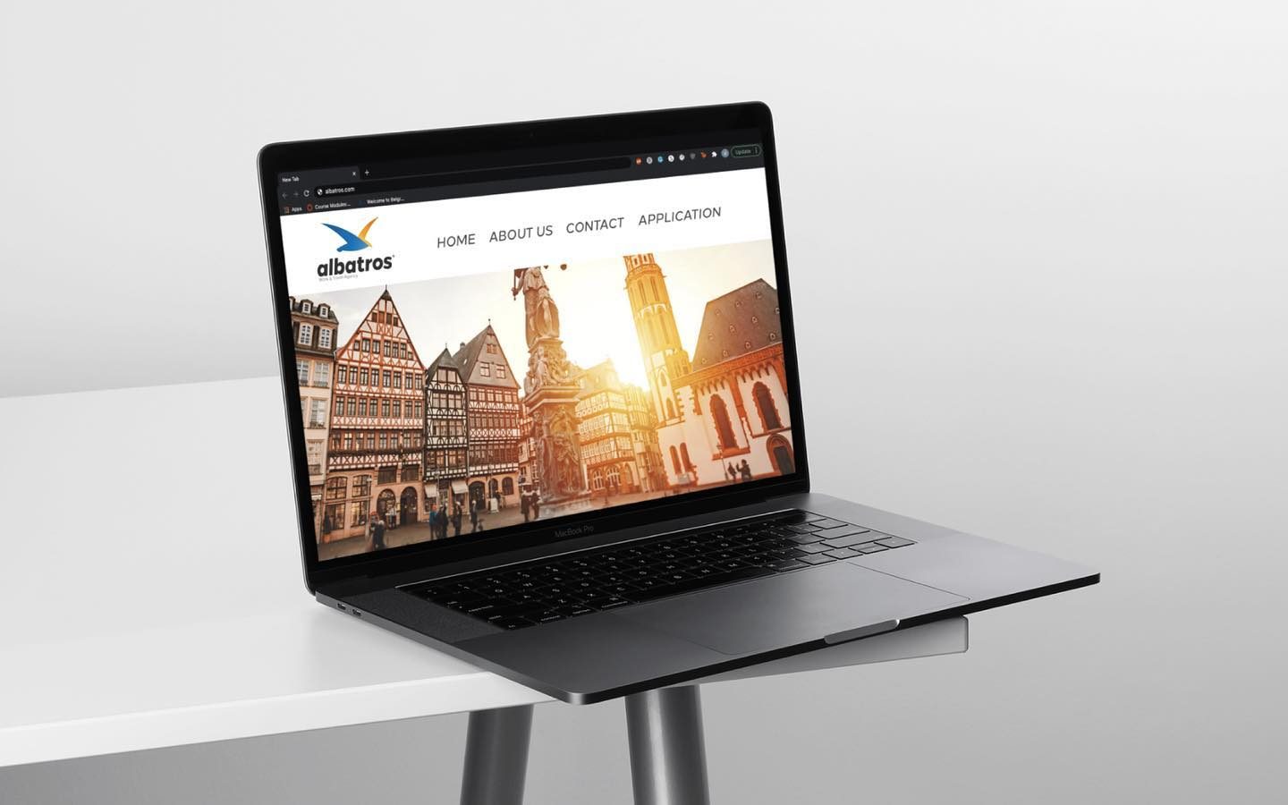
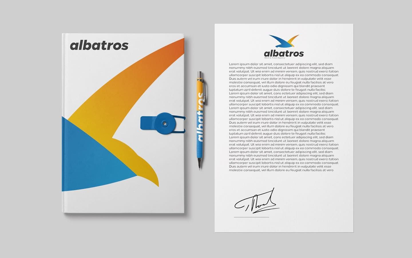
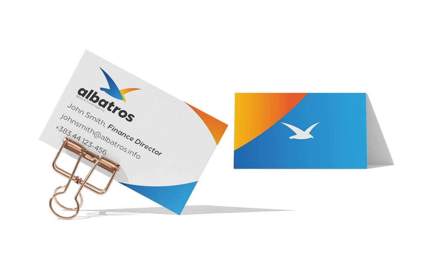
The brand
Albatros is a seasonal work-and-travel agency, named after the longest-traveling bird species.
Our approach
Distinct shapes in the symbol and an italic wordmark keep the logo always in motion, while the colour combination signals hope and trustworthiness, a mark designed to be memorable, distinctive and true to what the agency is about.
Scope of work
PersonaBrand LanguageLogoColoursTypographyImageryGraphic TreatmentsVideo & Motion
The work
Next project
Pulmo PlusLet's build your growth engine
The growth partner 95% of clients never leave.
Tell us where you want to grow. We'll show you exactly how we'd get you there, with the numbers to back it.